If you've been following, or just popping in, My hubby and I decided to add a new bedroom without adding square footage to our home by downsizing our master bedroom and bath. We kept both, but just scaled it down. I'm so glad we did and thankful that we've been able to do it. Again, when I went searching online for some inspiration on this subject, I couldn't find much of anything. So here's my take if your on the search too. : )
Okay so this has been a long time coming, but its pretty much done aside from a few touches!!!
Aside from my horrendous photos, I hope this post helps you if you are trying to figure a way to add another room like we did.
The tour begins with the master bedroom:
Here are a few of them close up. As you can see they are just random pieces.
I got this one in a re-gift type event/party. I really liked the black/grey colors and the simplicity of it.
These are just post card photos from Ikea.
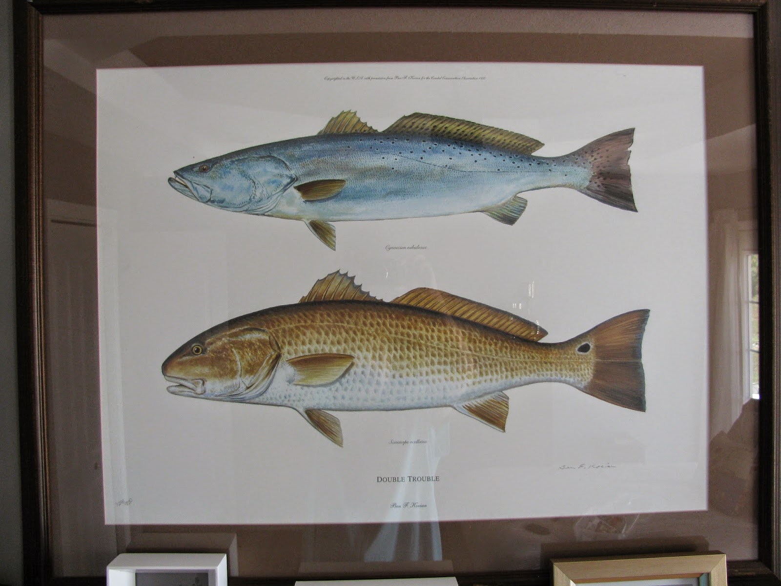
My sister bought a furnished home in Mississippi and she didn't want the fish art so she just gave it to me. Sometimes it's an added bonus when you and your sister's tastes don't jive.
I made these block art prints in an art class at some point in my life.
This is a crayon/wax scraping art piece I did. I don't know when. Just thought it was modern enough to work with the other stuff.
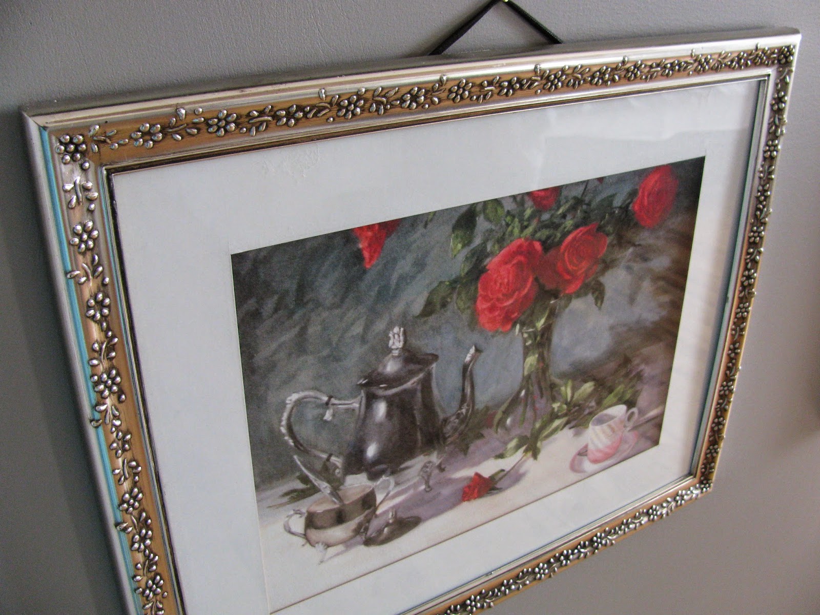
This is one that a very talented family member painted. It was hanging in my husbands grandparents home not long ago. It is sentimental in that way and a very classic and beautiful piece.
Here they are in their new spot on the wall.
This is the new closet area. This made out of three upper kitchen cabinets that we found at a closeout type place. They were med brown wooden cabinets that we painted white. There is a regular closet that faces it on the other side (my closet). My hubby's closet isn't pictured but it is on the wall close to the foot of our bed.
Here's a quick view of the before:

The Master Bath
Long and Narrow. Very narrow, but it works. The mirror we got off of craigslist for 20.00 My Mother and Father in law were headed to the city so they volunteered to get it for me. I didn't realize it was at the other end of the city, so they had to drive out of their way. Big oops on my part. Big thanks to the parents. We reused our toilet and pedestal sinks from the old bathroom. The little table between the pedestals was from my husbasnd's grand parents home.
We finally finished the homemade linen cabinet. I tried to get a full photo of it, but it was hard to do since the room is so narrow. I had to take a photo through the pocket door to get this shot. Again, those are actually
two kitchen cabinet uppers that we stacked and then added trim and legs,
and then painted. Hubby cut out two of the door panels and added glass to the
top cabinet. I'm really proud of him. He did a great job.
Here's the very appreciated high window. You couldn't imagine the amount of light it lets in. You can even see a cloud or two float by every so often. : ) I can't believe he found the window for only 10.00 at our local peddler's mall. So thankful for that.
The multipurpose room (currently the nursery):
I know the walls are a little bland, but I plan to add some art soon I hope.
Iggy, Inky and I painted some gold triangles in a random pattern on just this wall to add something fun to the room.
I found the wishbone fabric at our local fabric store. It just seemed neat and whimsical with its sketched look. I sewed a little duvet cover mainly for looks, but later I'm sure Baby Wex will snuggle underneath it.
This is the view looking from the dining/living room into the nursery. Why glass? Well, because it's a multipurpose room. It's meant to start off as a nursery, then turn into a school room and then later into our attached master office. I like that the glass gives the illusion of more space in the dining/living room. Your eye keeps moving beyond the wall/door. We have no problems so far with the glass door and the baby being able to see out during nap time/ bedtime, but she is still in a crib. We'll see what happens when it becomes a toddler bed and she can get up and peep out.c : ( Continuing the same flooring into that rooms helps in the same way as well I think. It will make more sense when the room becomes the schoolroom or office. I found it to be useful in all three setups to have access to the master bathroom. A lock on the bathroom side helps with privacy.
The view from the nursery window. So glad to get to finally take advantage of the view of our flowers. This used to be the window right in front of our master bathtub. The window used to ALWAYS be closed, but now I just love to see what's out there.
Iggy helped me to make this critter just before Baby Wex was born. Now she perches on the changing table.
When in doubt in adding some whimsy/modern touches on a small budget, visit Ikea. I don't like to Ikea-fy my whole house. That can get a little Ikea-overwhelming, BUT, a little here and there really does pack a punch. In this room I added from Ikea, 2 throws: black and white - stole from my living room and beige, a black and white round rug, faux sheep skin rug, a beige area rug and an Ikea pendant light. Really fun stuff!
I'll post one more time when I finally get some art on the wall
Thanks for sifting my thrift!
Marsha


